It’s probably my brain. I’m an engineer and I want things to be clear, square, and precise.
That obviously shows in my photographs as well.

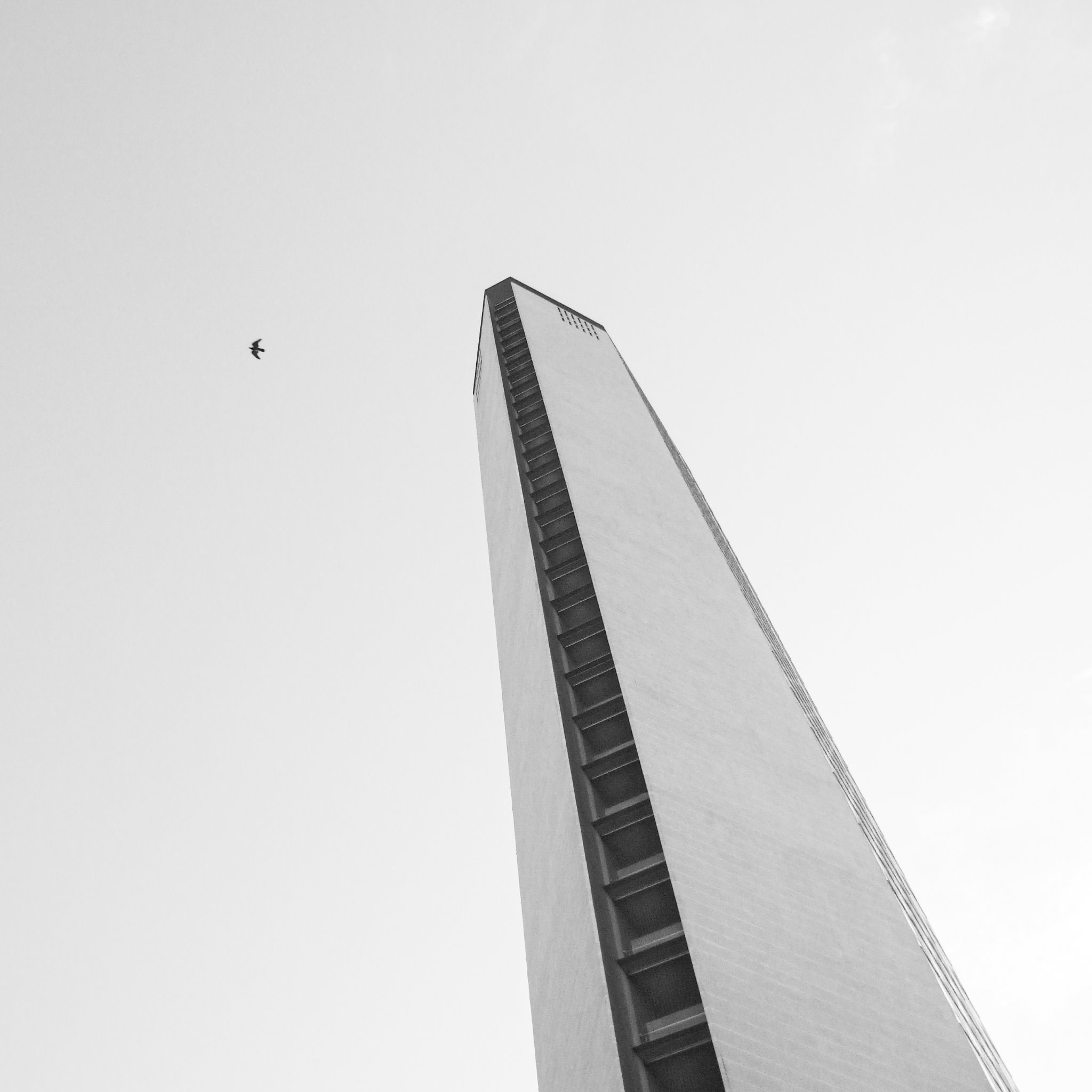
Of course there are many possibile interpretations of minimalism, especially in photography. The image above is an example from 2007 that I still love and that I would call a rather obvious specimen of minimalism.
Lately, what I find myself looking for is a scene that is easy to understand, without distractions: I want the viewer to immediately grasp the key of the image. Most of the time that translates into photos that have few elements in them – maybe just the subject – but not always.
Let’s see an example.

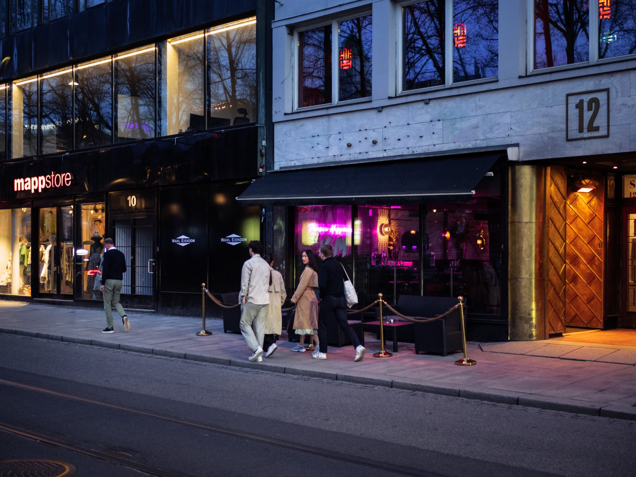
This picture is relatively crowded in my eyes, becuase it has many elements fighting for your attention. First off, there are five people in in. Then there are lights, shop signs, windows, a road, an entrance to some place…
But there’s a trick. You see, our brains are hardwired to spot faces: that’s why the very first thing most of us notice in this photograph is the woman’s face looking back at us. Without that single detail, I would have discarded that image.
Here is another non-obvious example.

That photo does not contain an obvious subject nor other prominant elements and yet, in my opinion, it works because it is a tiny slice of what you can find in a mountain location with some beautiful glowing light. It is a little isolated world that can live on its own.
So, my interpretation of minimalism is somewhat blurred and is more conceptual than visual. It’s more about the experience of viewing the image than about its mere visual properties. The most important aspect is that I find all of it extremely funny and enjoyable, so I am naturally encouraged to look for and take photographs and explore more ideas of minimalism.

